
Some of the most loved American posters were made by artists whose names were never printed on them. In the late 1930s, artists working for the Works Progress Administration designed and hand-printed posters inviting the public to visit national parks, attend free ranger talks and simply See America. Bold, flat color, crisp lettering and a sense of optimism made them effective then. The same qualities make them some of the easiest vintage art to live with now. This guide covers where they came from, what to look for and how to choose the right size and room for one.
Where WPA posters came from
The Works Progress Administration was created in 1935 as part of the New Deal, and its Federal Art Project employed artists across the country. Poster workshops within the project produced designs for public health campaigns, education, theater, community events and travel. Many were made with silkscreen, a stencil-based process that allowed small studios to print editions in strong, even layers of color. The Library of Congress holds more than 900 of these posters, and much of what survives is known from collections like it, because posters were made to be used up and thrown away.
That history explains the look. Silkscreen favors flat shapes, limited palettes and sharp edges over fine gradients. Designers simplified mountains into stacked planes of color and turned sky into a single confident band. The result reads clearly from across a room, which is exactly what you want from a framed print.
Designers simplified mountains into stacked planes of color and turned sky into a single confident band.
The national park series
Around 1938, WPA artists produced a set of posters for the National Park Service, promoting the parks and the Ranger Naturalist Service — the guided walks, campfire programs and talks that rangers offered visitors. Several carry the line “A Free Government Service.” Each poster pairs a park’s signature landform with simple text, so the design works as both a landscape and a piece of graphic history.
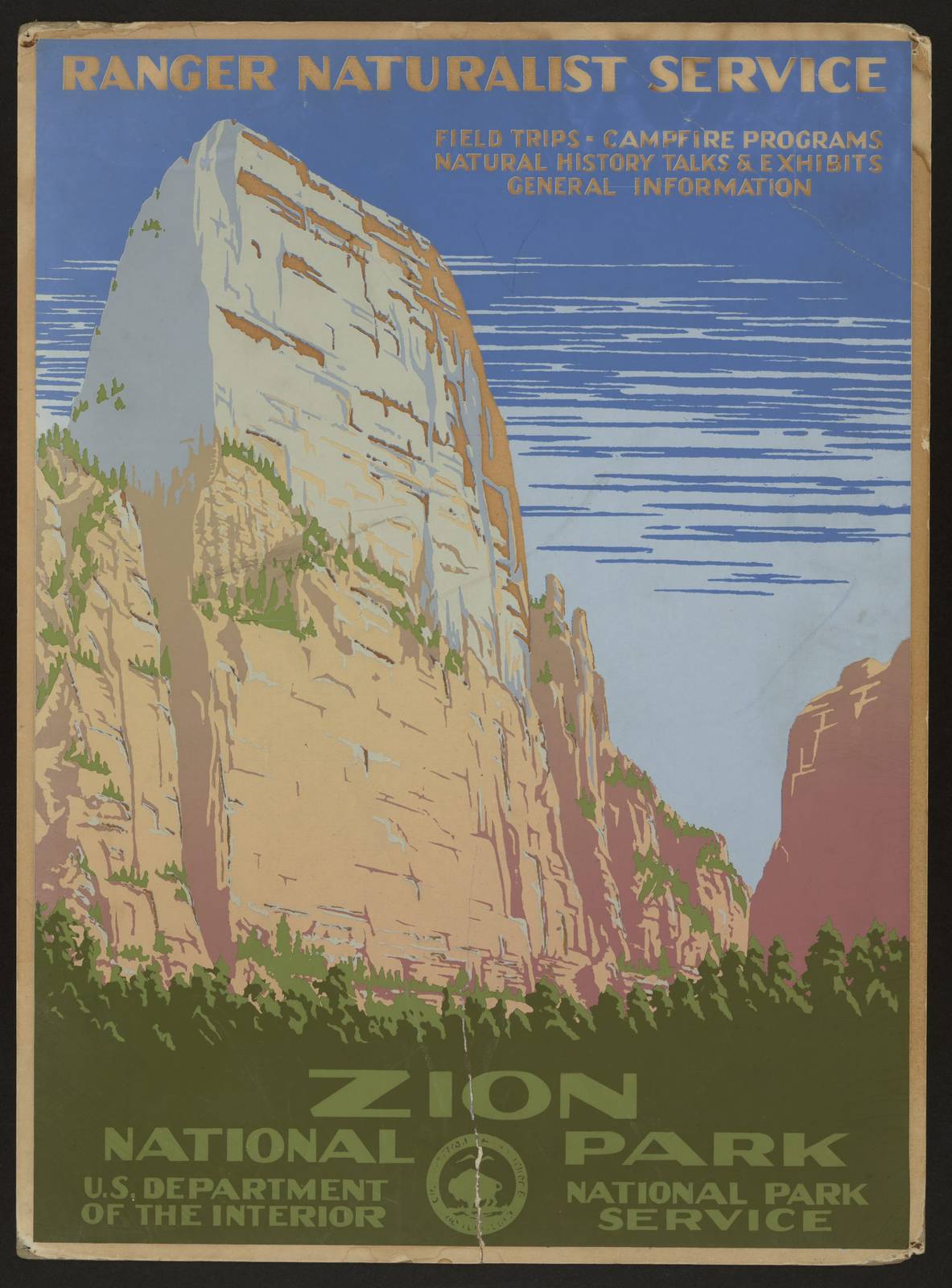
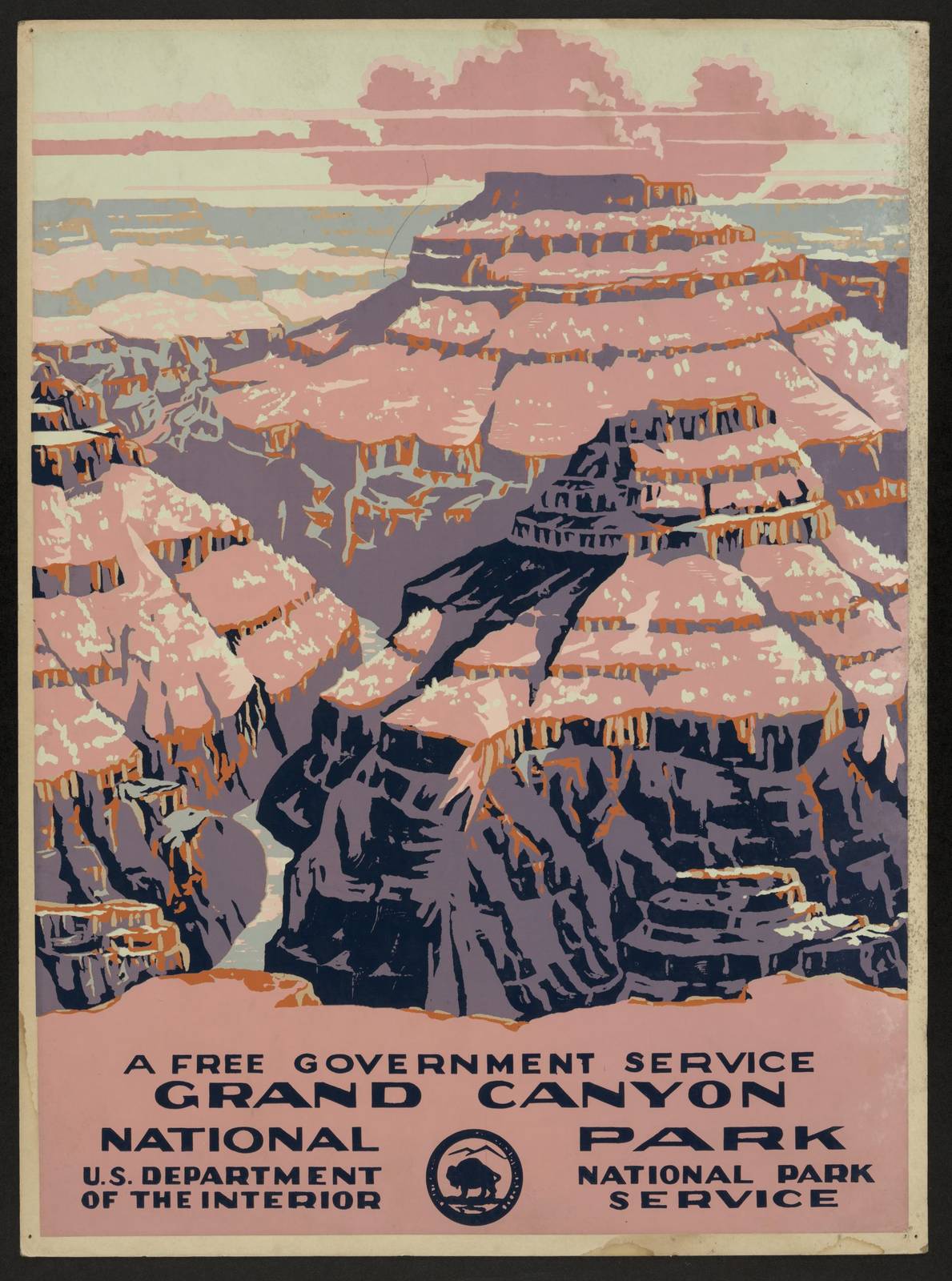
The Zion poster builds its towering canyon walls in warm reds and oranges, a natural fit for rooms with wood, leather or terracotta. The Grand Canyon poster layers the canyon into receding bands, giving a sense of depth with very few colors. Both parks were established as national parks in 1919, and both posters suit a living room or office where you want a warm, grounded focal point.
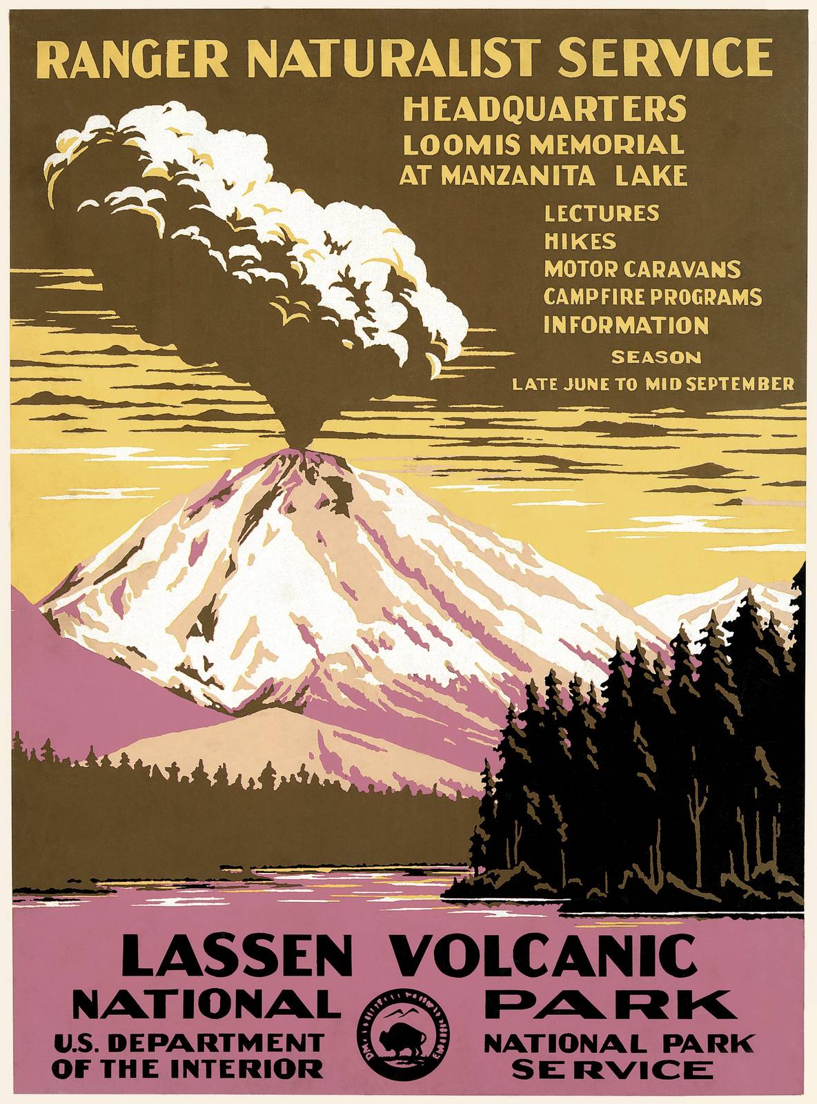
Lassen Volcanic National Park in Northern California was established in 1916, during a period of eruptions at Lassen Peak that lasted from 1914 to 1917. The Lassen poster gives the volcano a striking, graphic presence and is a favorite for anyone who has driven the park road or hiked toward the summit. Yellowstone, the first national park, established in 1872, is represented by a Ranger Naturalist Service poster of its own, an easy gift for a family that has made the trip.
See America
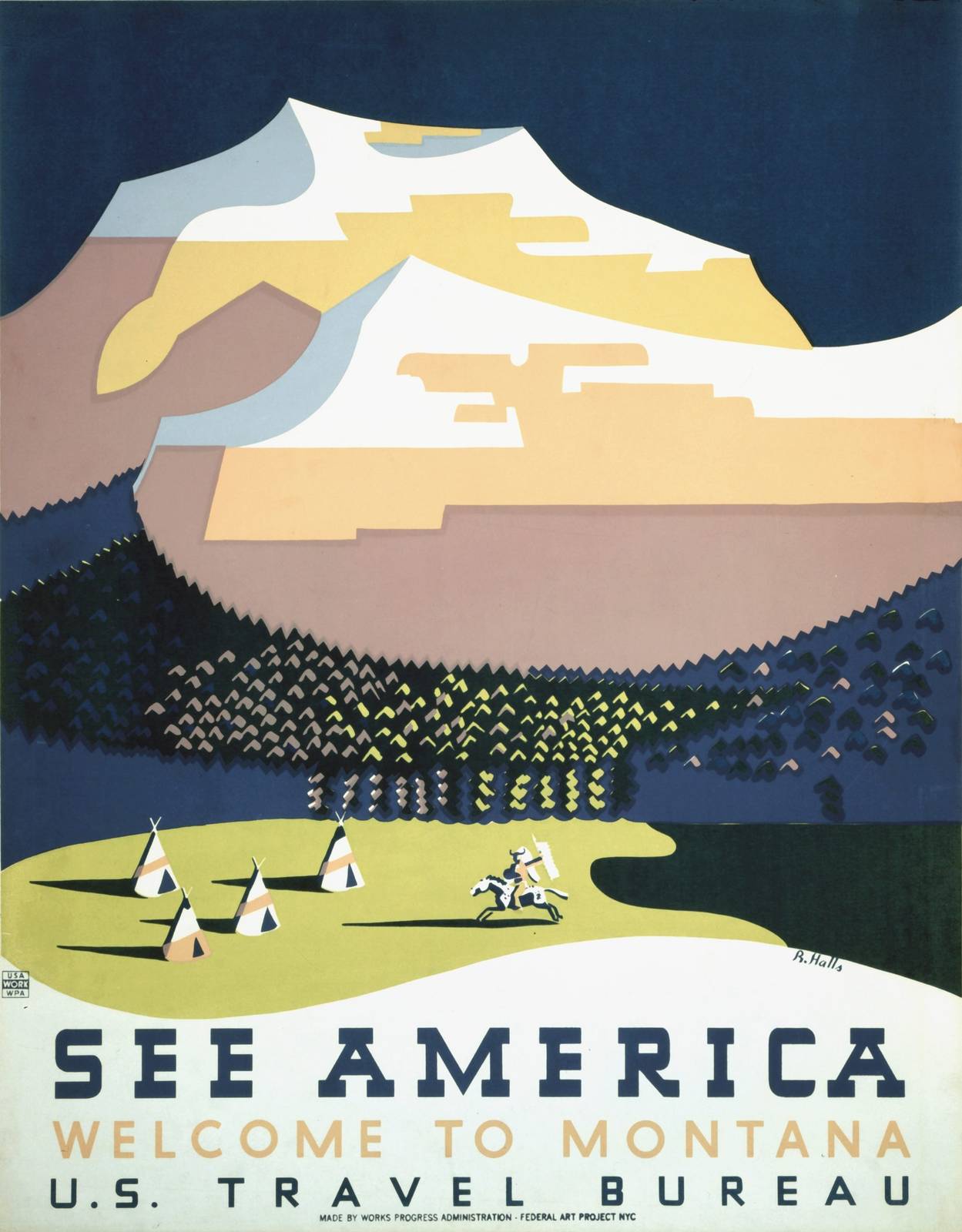
Alongside the park series, WPA artists in New York produced a run of travel posters under the banner See America, encouraging Americans to explore their own country. These designs range widely in subject, from Western landscapes to regional attractions. Our 1938 See America poster is a good choice when you want the spirit of the series without tying the wall to one specific place. See America: Welcome to Montana, credited to Richard Hall, is a strong pick for anyone with Montana roots or a ranch-and-mountains style home.
How to choose a size
Every FrameAnyPhoto print is framed at the artwork’s true shape, with nothing cropped, and ships free in the US. Each work lists the sizes its scan supports:
- Small (15 × 20 in), $195. Right for a bookshelf wall, a narrow hallway, beside a doorway, or as part of a gallery wall of three to six posters.
- Medium (18 × 24 in), $295. The most versatile size. It holds its own above a desk, a dresser or a bench, and two Mediums side by side make a clean pair over a sofa.
- Large (27 × 36 in), $395. Offered where the source scan has enough detail. Use it as a single statement piece above a sofa, a bed or a fireplace. Zion, Grand Canyon and Lassen are currently offered in Large.
A simple rule of thumb: over furniture, aim for art roughly half to two-thirds the width of the piece below it, and hang the center at about eye level. Bold silkscreen designs read well from a distance, so they can go a little smaller than a detailed painting without getting lost.
Building a set
Because the park posters share a visual language, they group well. A row of three — Zion, Grand Canyon and Lassen — in matching sizes makes an instant travel wall for a hallway or a stairway. For a mixed wall, combine one or two park posters with a See America design and keep spacing even, about two to three inches between frames. If you are marking places you have actually visited, the set can grow one trip at a time.
Explore the full series in our WPA national park posters collection, see more of the program on the WPA / NPS artist page, or widen the search to all of our vintage travel posters.
